As the 2016 year draws to an end, designers continue to develop interesting and bold styles.
Throughout the year, as designers shift away from simplistic and minimalistic directions, we have been introduced to many new styles and trends. And now, we are starting to move back towards a more visually comprehensive and impactful design trend. With the implementation of new technologies and software, we continue to see the expansion of possibilities of what is still to come in the realm of web design.
Thus, we have narrowed down our top six web design style predictions that look to develop and continue through 2017, as well as some recent examples that have already started to take hold.
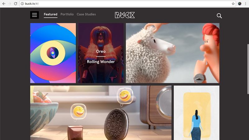
1. Subtle Microinteractions
Only until recently, microinteractions have really begun to gather some serious traction on the web, and as multiple new and sophisticated tools for prototyping and implementing these are developed, it looks like this trend is on path to continue. Buck.tv is a perfect example of this, as the hover effects are highly stylized and feature beautiful and styling transitional animations.
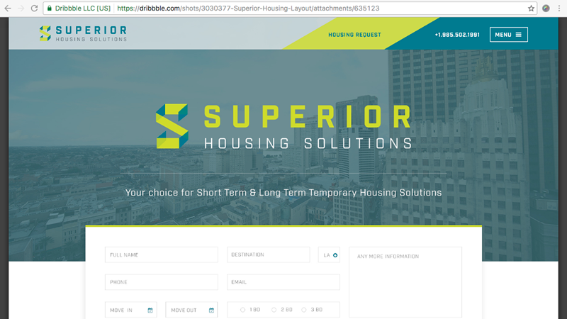
2. Overlapping Depth Elements
When Google introduced their Material Guidelines, it was the beginning of something big, as it created the trend of overlapping elements to create depth. By doing something innovative and having the page traffic and audience that Google has, their use of contrasting colors and large shadows has now become a trend in modern web design. The result: it creates a subtle, yet high impact on the user and can help produce a satisfying transition between elements as the user makes their way down the page.
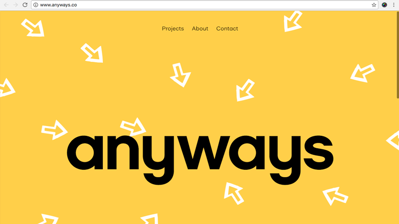
3. Hand-drawn Iconography
Another web design trend that we believe will carry over into 2017 involves the use of Hand-drawn Iconography, and anyways.co is a perfect example. Their site shows the rate of success that carefully implemented, hand-drawn icons can provide as well as providing great contrast to clean and uniform typography. As designers and marketers look to increase conversions with subtle, yet contrasting visual hints, we believe this trend will continue to take hold in 2017.
4. Colorful Shape Gradients
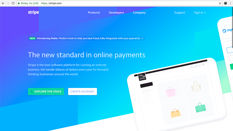
When it comes to Colorful Shape Gradients, Stripe’s new website says it all. Their new site was incredibly well-received across the design industry as it gives a glimpse at the styles that designers may be inspired by as we ease into 2017. One of the most bold and impactful styles used by Stripe involves the use of the shape-filled gradient header, and is now becoming ever more synonymous with their brand, as it incorporates multiple angular gradients and combines them to great effect. In 2017, we are likely to see more gradients introduced, as this is a trend that shows no signs of slowing down.
5. Minimal Product Mockups
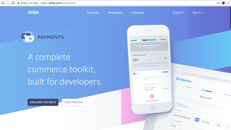
Colorful shape gradients aren’t the only thing that Stripe is setting trends for, as they look to have solidified the use of Minimal Product Mockups, as opposed to a realistic counterpart. This can provide a less severe, subtle flow to a website, and presents the opportunity for the work inside the mockup to stand out more than ever. This is a great free version of such a mockup, and we believe will help serve as a great resource in using the latest 2017 trends in your web designs.
6. Large Colored Shadows
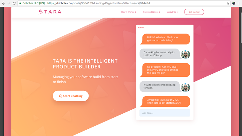
As 2017 approaches, Large Colored Shadows as opposed to their small monochrome equivalents are continuing to make their comeback, and designers are looking for more creative ways than ever to use them in their designs. When combined with a colored background, this style can enhance the shadowed element and overall visual design of a website.
We are starting to see web design trends shifting away from the very flat trends that have been so prevalent in previous years. Nowadays, designers are continuing to develop visually interesting and bold styles that are effective in conveying a brand while maintaining and improving the ease of accessibility for the user. So take a hold of these new trends, try something new and exciting in the web design world, and embrace the trend setting of web design. 2017, we’re ready for you.

